Component workflows at Beckon
Interaction design, UX/UI
Role
UI Design, design specs
Duration
Jun-Dec 2021
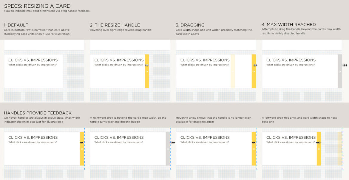
A workflow documents the process of a user working through a common — but possibly complex — task in the product (e.g. “resize a card on the dashboard grid,” as seen in the image above). At each step in the workflow, a wireframe or high fidelity screen mockup shows the screen available to users.
The workflow below is a depiction of the comment pane within the Beckon app, and the process of adding a comment for other members on the team. Starting with the empty state offering only the primary call to action “Write a comment…” it follows the process of adding a comment, and shows how to edit an existing comment. The specs detail the size and location of every component of the Comments pane, including callouts for in situ features like comment sorting and text styling.
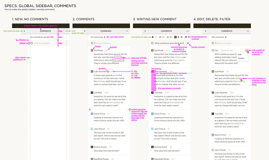
Adding, editing, deleting a comment
The workflow below proposed a method for embedding a link — or edit an existing link — for a text string within a Beckon dashboard card. Starting with the selection of the designated string, we follow as the URL is added and committed, and finally how the edit function can be called up again.
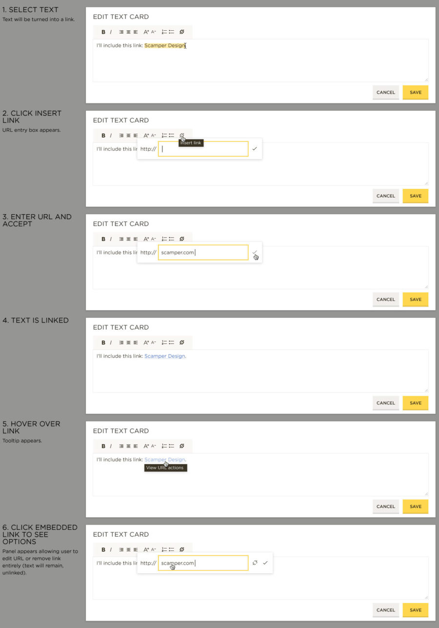
Embedding a link
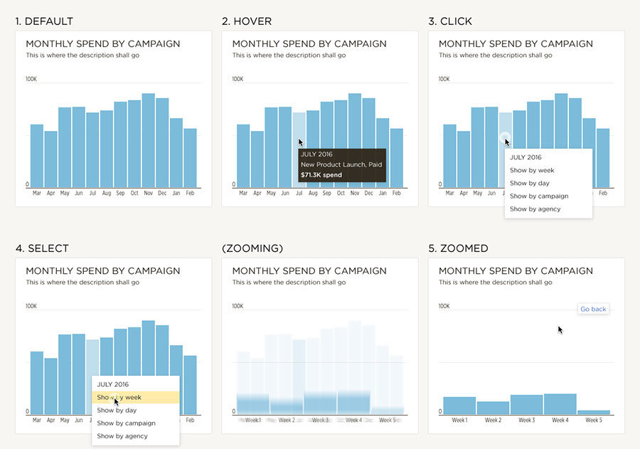
Below, a straightforward workflow showed the process of zooming into a chart’s single month bar to reveal its component weeks. This included a menu of possible zoom levels, and “back” navigation.
Zooming into a bar in a chart
Column sorting is a common task, and the convention needs to be consistent throughout a workspace. The workflow below captures every possible interaction, and the respective effect on the table content.
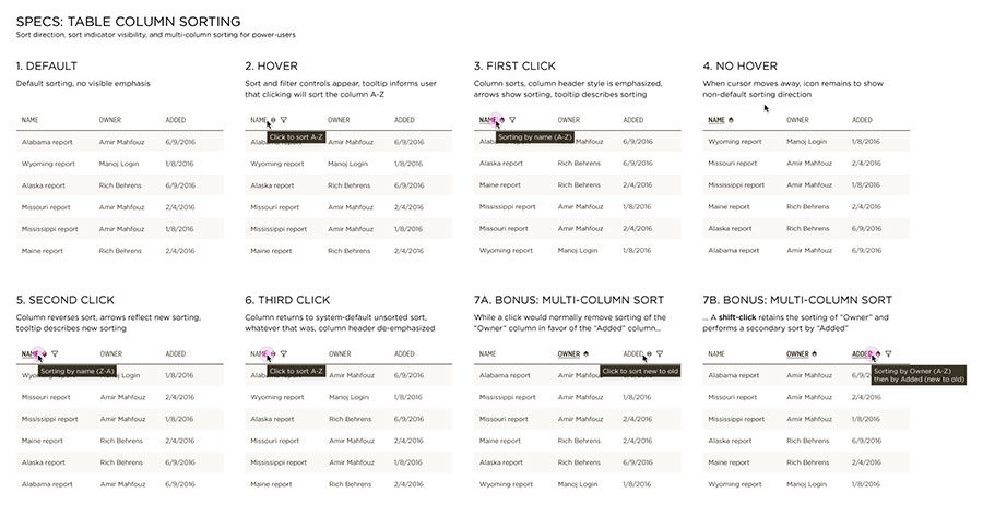
Column sorting conventions