Branding, Beckon
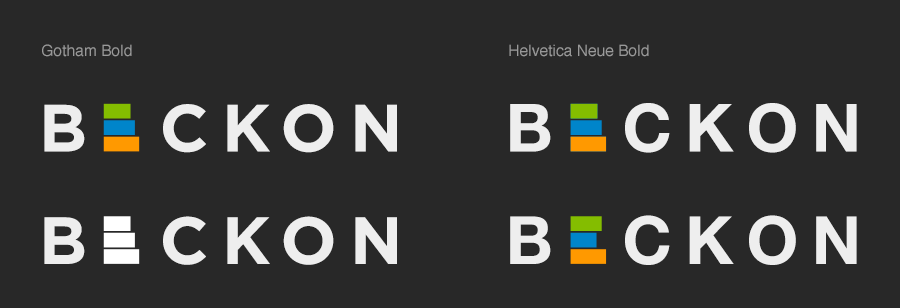
Logo, specs
Role
Identity Design
Team
Executive Team @ Beckon
Duration
Nov 2011

In the beginning was the word “beckon,” and the company’s value proposition, which was to “[Unite] your marketing data once and for all.”
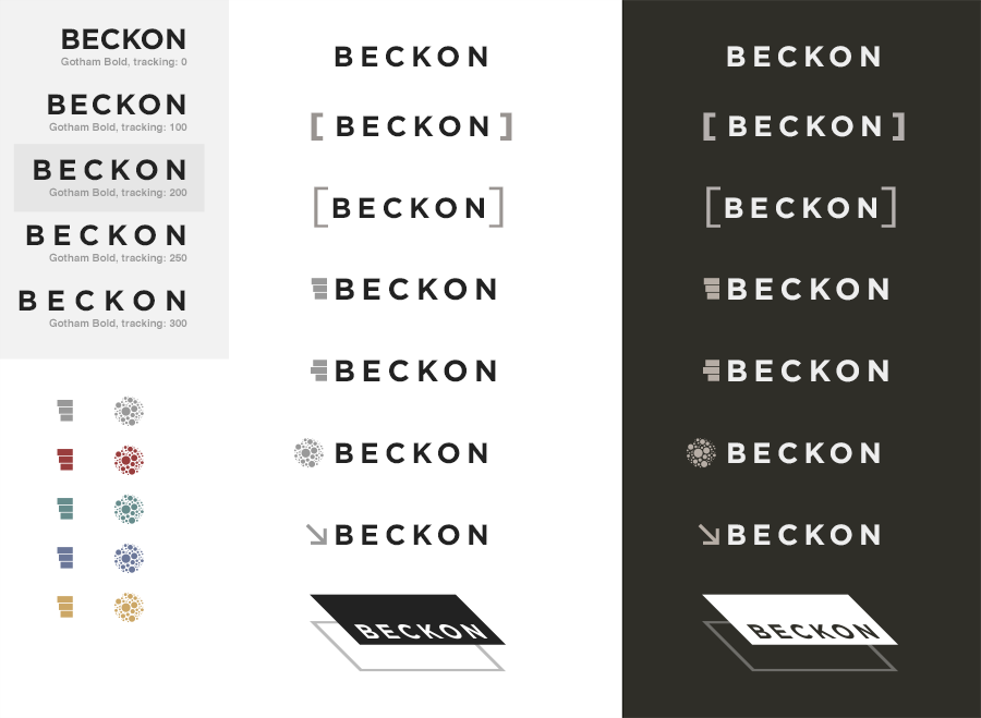
My first thought was to take a stab in the dark, with an iconic representation of a visualization paired with a simple, clean wordmark.
Beckon logo, initial concept
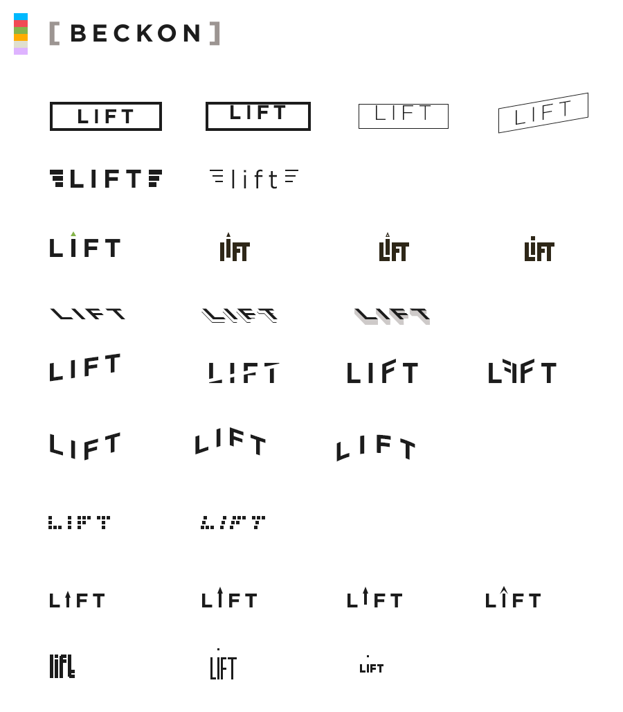
Using that as a launchpad, I proceeded to use the two evocative starting points — beckoning and uniting — and explore various themes, some more literal than others.

Beckon logo, first exploration
After reviewing those concepts, we pared back, and I designed a second round of possibilities.
Beckon logo, second exploration
What stuck with us was the square brackets, which was one of the simplest approaches. In literature and science, square brackets are used to add contextual clarity, as a grouping symbol, or to indicate a matrix. Thematically and aesthetically, we had our winner, a mark that conveys unity, clarity, and approachability.
Beckon logo, final
For sub-brands, like Beckon’s Lift email newsletters, I went through a similar process. Initially I wanted to throw off the reins, and really explore the concept of “lift,” but in a simplified, iconic way.
Beckon Lift logo exploration
In the end, we gravitated to the idea of a green up arrow, because it captured the meaning of the word, and evoked the rise in a value over time.
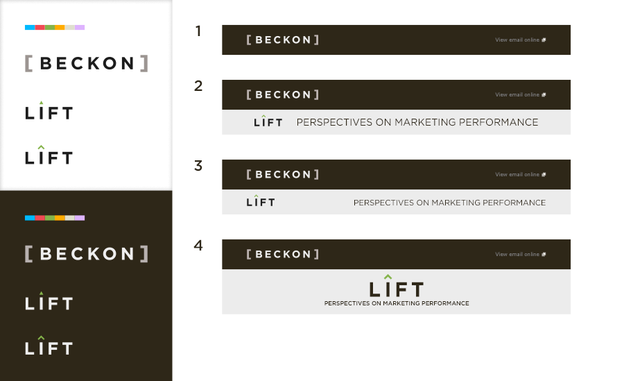
Beckon Lift logo, final