Beckon
Product design, UX/UI
Role
Product Designer
Team
Product Team @ Beckon
Duration
2012-2017
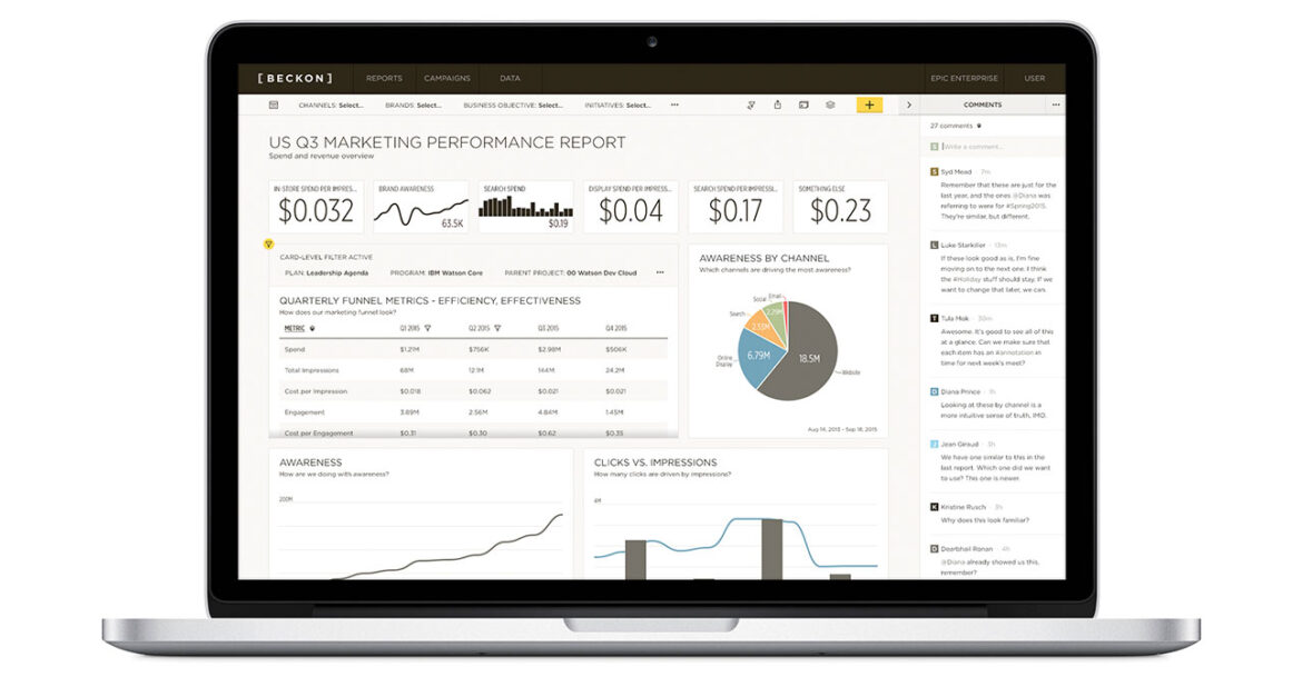
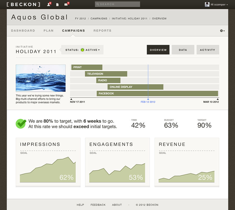
From the start, I wanted Beckon’s mandate — to deliver clean, trusted marketing data and real-time marketing intelligence — to be reflected in its presentation.
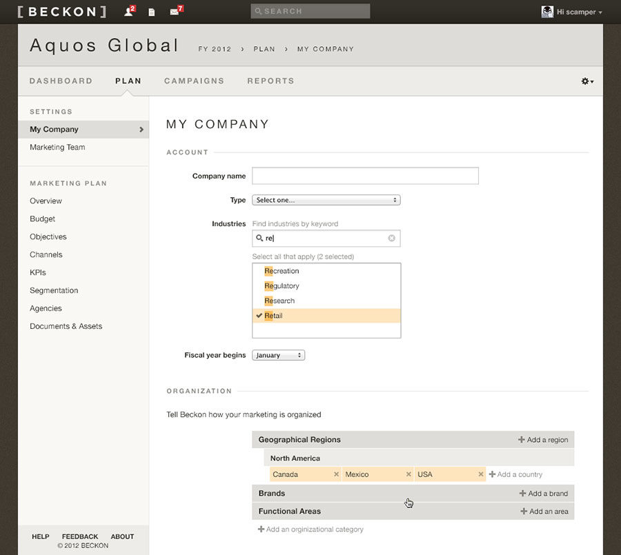
Serving as Creative Director and design lead, I worked with Beckon to shape this UX strategy, going back to a seminal 2012 article by Matt Gemmell on what he called “augmented paper.” Specifically, he cited an interface that was “quiet,” where the presentation of information was sensitive to layout, while the interface was minimized.
For me, the result of hewing to a more print-like sensibility was that we would strip each component down to its core essence. A side benefit was that the data visualization would be afforded the prominence it deserved, rather than competing with a widget-heavy aesthetic.
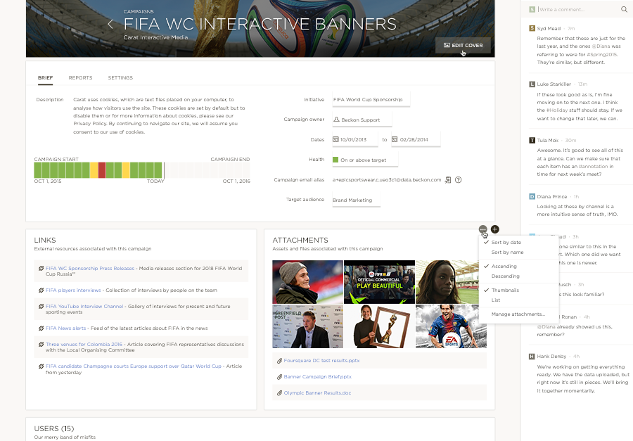
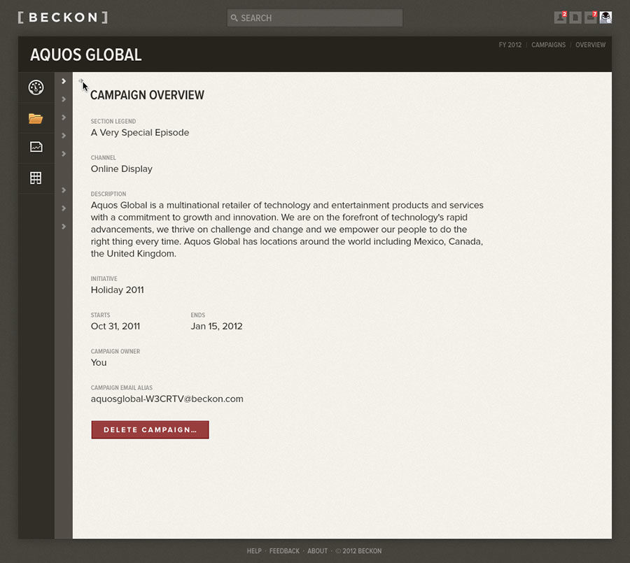
Beckon Campaign Overview
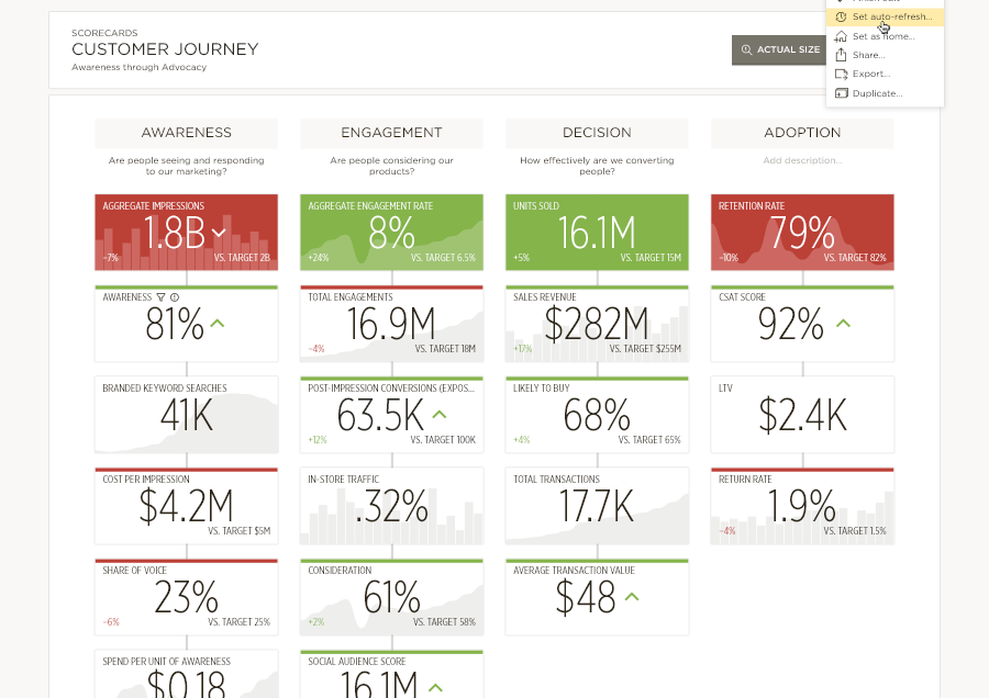
Beckon Scorecard
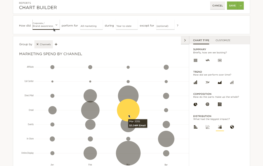
Beckon Chart Builder
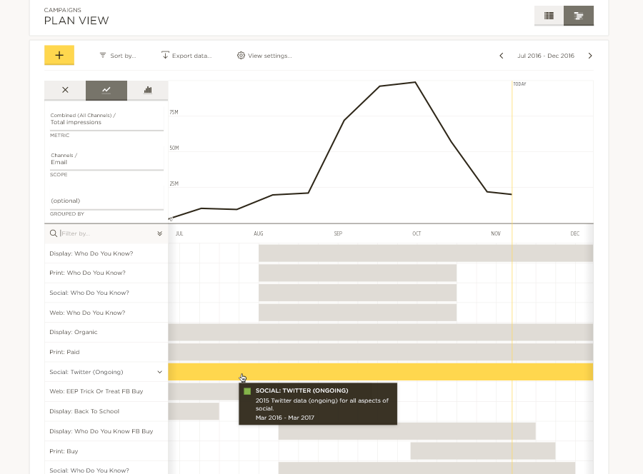
Beckon Campaign Calendar (Gantt view)
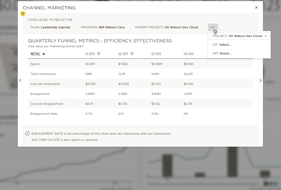
Beckon card filter (zoomed view)
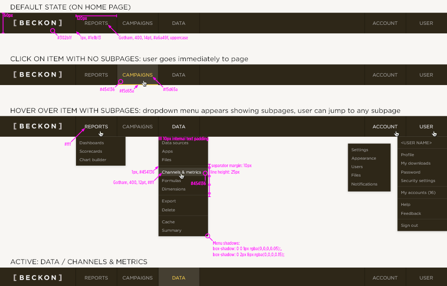
Beckon navigation specs
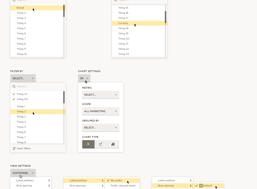
Beckon campaign menu exploration
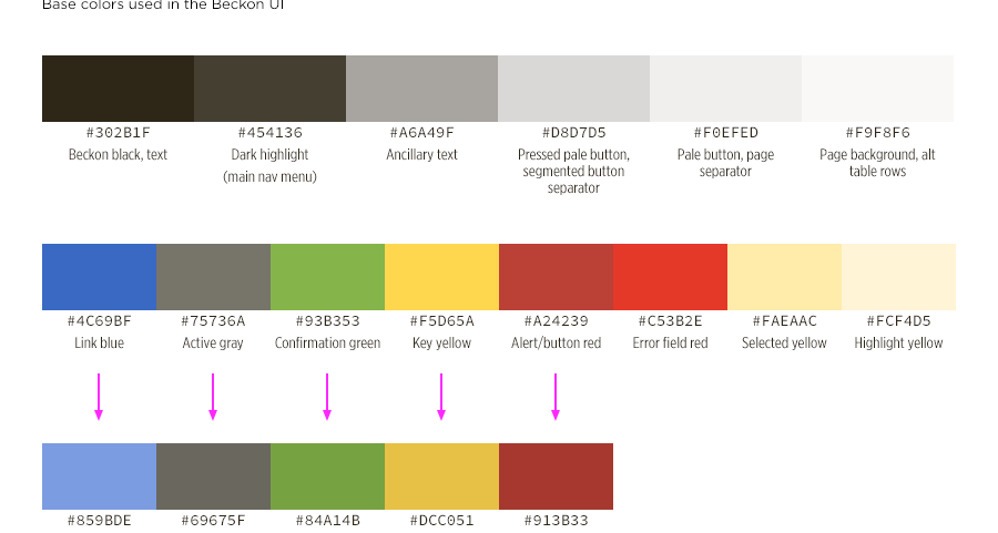
Beckon UI palette specs
Beckon pre-launch concepts:
